Tutorial - Cascading Dropdowns & Auto-Selecting Values Based on Another Field
Building smart, dynamic dropdowns is one of the most common needs in a form. Sometimes you want Dropdown B to filter its options based on Dropdown A (classic cascading dropdown). Other times, you don't want filtering at all, you only want Dropdown B to auto-select a recommended value based on what the user picked in Dropdown A.
This guide covers both techniques, from filtering to auto-mapping.
📝 Important: Understanding Field Names
Throughout this tutorial, you'll see us use names like category and item.
Every dropdown has two important names:
- Label - The display name users see (e.g., "Category", "Department")
- Property Name - The technical ID used in code (e.g.,
category,department)
You set these when creating the field in the form builder:
- Label is on the main Display tab
- Property Name is under Technical Properties → Property Name
Why this matters:
- When we say "Choose
Categoryin Refresh Options On", we mean choose the Label from the dropdown - When writing code like
data.category, we use the Property Name
Think of Labels as the friendly names you see, and Property Names as the technical IDs used behind the scenes.
🧩 Part 1 - Cascading Dropdown: Filter Dropdown B Based on Dropdown A
This is the typical scenario:
- Dropdown A has categories
- Dropdown B lists items
- Changing Dropdown A filters the available options in Dropdown B
Example behavior
| Category | Items Shown |
|---|---|
| Fruit | Apple, Orange |
| Vegetable | Carrot, Broccoli |
Dropdown B updates immediately whenever Dropdown A changes.
Step-by-Step Setup
1. Create Dropdown A
- Label: Category
- Technical Properties -> Property Name:
category - Data -> Data Source Type: Values
Values:
| Label | Value |
|---|---|
| Fruit | fruit |
| Vegetable | vegetable |
💡 Pro Tip: The Value column is what matters for the code! In step 2, you'll use these exact values (fruit and vegetable) in your JavaScript code. The Label is just what users see on the screen.
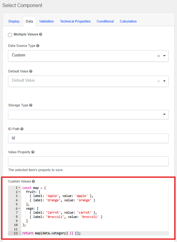
2. Create Dropdown B
- Label: Item
- Technical Properties -> Property Name:
item - Data -> Data Source Type: Custom
In Data → Custom Values, paste:
const map = {
  fruit: [
    { label: 'Apple', value: 'apple' },
    { label: 'Orange', value: 'orange' }
  ],
  vegetable: [
    { label: 'Carrot', value: 'carrot' },
    { label: 'Broccoli', value: 'broccoli' }
  ]
};

return map[data.category] || [];
Understanding the code (in plain language):
The code creates a simple lookup table. Let's break it down:
const map = {
  fruit: [...],      // When category = "fruit", show these items
  vegetable: [...]   // When category = "vegetable", show these items
};
-
data.category- This reads the value from your first dropdown (the one with Property Name =category)- For your forms: If your first dropdown's Property Name is
department, change this todata.department
- For your forms: If your first dropdown's Property Name is
-
map[data.category]- This looks up which list to show based on what the user selected- If user picked "fruit" → show the fruit list
- If user picked "vegetable" → show the vegetable list
-
|| []- If nothing is selected yet, show an empty dropdown (prevents errors)
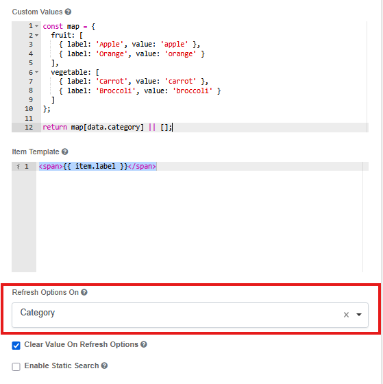
3. Configure the Refresh Behavior
In the Item dropdown settings (Dropdown B), find these two important settings:
Setting #1: Refresh Options On
Choose: Category
Wait, why "Category"?
Because Category is the Dropdown A in step 1. This creates a connection between the two dropdowns.
For your own forms: Replace Category with whatever Label YOU chose for your first dropdown. For example:
- If your first dropdown's Label is
Department, chooseDepartmenthere - If your first dropdown's Label is
Product Type, chooseProduct Typehere
What this does: It tells this dropdown: "Watch that other field. Whenever someone changes it, reload my options."
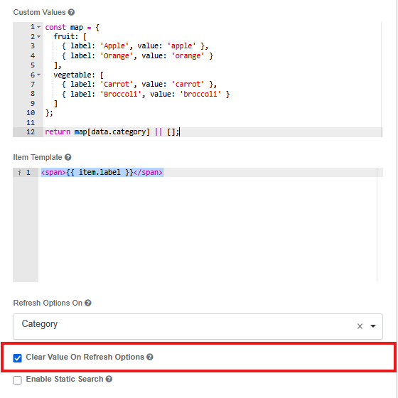
Setting #2: Clear Value On Refresh Options
Set this to: true (tick the checkbox)
Why?
Imagine this scenario:
- User picks "Fruit" → then picks "Apple"
- User changes their mind and picks "Vegetable"
- But "Apple" doesn't exist in the vegetable list!
By setting this to true, the dropdown automatically clears "Apple" when the user changes to "Vegetable". This prevents invalid data.
The user will simply need to make a new selection - which makes sense because they changed the category anyway.
Now Dropdown B only shows items related to the chosen category, and automatically clears when the category changes.
🧩 Part 2 - Auto-Selecting Dropdown B Based on Dropdown A (Without Filtering)
In this pattern:
- Dropdown B does not filter
- Dropdown B still displays all values
- BUT it will auto-select a recommended value based on Dropdown A's choice
- The auto-select is smart - it only suggests a value when the field is empty, and respects the user's manual changes
Example behavior
| Category | Auto-selected Item (Initial) |
|---|---|
| Fruit | Apple |
| Vegetable | Carrot |
Note: If the user manually changes their selection, the auto-select won't override it (depending on your Clear Value On Refresh setting - explained below).
This is called auto-mapping.
Step-by-Step Setup
1. Dropdown A (Category)
Same as before:
| Label | Value |
|---|---|
| Fruit | fruit |
| Vegetable | vegetable |
2. Dropdown B (Item)
- Label: Item
- Technical Properties -> Property Name:
item - Data -> Data Source Type: Values
Give it all values (notice we're NOT filtering - all items are available):
| Label | Value |
|---|---|
| Apple | apple |
| Orange | orange |
| Carrot | carrot |
| Broccoli | broccoli |
💡 Pro Tip: Remember these Values (apple, carrot, etc.)! You'll need to use them exactly in your auto-select code in step 3.
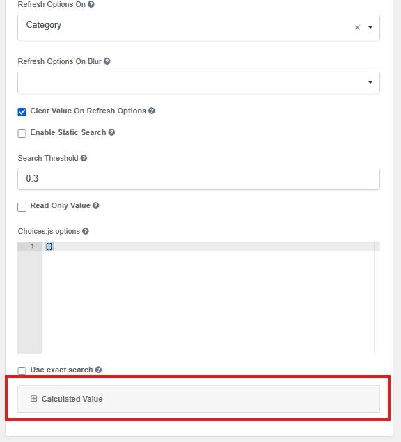
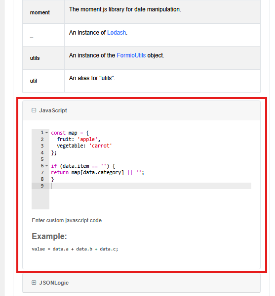
3. Configure Calculated Value
In Data → Calculated Value, in the JavaScript box, paste:
const map = {
  fruit: 'apple',
  vegetable: 'carrot'
};

if (data.item == '') {
  return map[data.category] || '';
}
Understanding the code (in plain language):
This code does two things:
1. Creates a recommendation table:
const map = {
  fruit: 'apple',      // When category = "fruit", recommend "apple"
  vegetable: 'carrot'  // When category = "vegetable", recommend "carrot"
};
2. Checks if the item field is empty:
if (data.item == '') {
  return map[data.category] || '';
}
What this means: The code ONLY auto-selects a value if the Item dropdown is currently empty. If the user has already selected something, it won't override their choice!
This is important because:
- When a user first selects a category → auto-select happens (helpful!)
- If user manually changes the item → it respects their choice (doesn't keep resetting)
Breaking it down:
-
data.category- This reads what the user selected in your first dropdown- For your forms: If your first dropdown's Property Name is
department, change this todata.department
- For your forms: If your first dropdown's Property Name is
-
data.item == ''- Checks if the Item dropdown is empty- For your forms: If your second dropdown's Property Name is
product, change this todata.product == ''
- For your forms: If your second dropdown's Property Name is
-
map[data.category]- Looks up which item to recommend- If category is "fruit" → recommend "apple"
- If category is "vegetable" → recommend "carrot"
-
|| ''- If no category is selected, return empty (leave dropdown blank)
Important: The values you return (like 'apple', 'carrot') must exactly match the Value column in your dropdown options from step 2.
4. Configure the Refresh Behavior
In the Item dropdown settings (Dropdown B), find these settings:
Setting #1: Refresh Options On
Choose: Category
Why "Category"?
Because that's your first dropdown's Label. This tells the second dropdown: "Watch that field. When it changes, run my auto-select code again."
For your own forms: Choose YOUR first dropdown's Label here.
Setting #2: Clear Value On Refresh Options
You have two choices here, depending on the behavior you want:
Option A: Set to true (tick the checkbox) - Always auto-select when category changes
- When user changes category → field clears first → calculated value sees empty field → auto-selects new recommendation
- User ALWAYS gets the recommended item for the new category
- Good for: Strict recommendations where you want to guide users
Option B: Set to false (leave unchecked) - Preserve user's manual selection
- When user changes category → field keeps current value → calculated value sees non-empty field → does NOT auto-select
- User's manual choice is preserved even when category changes
- Good for: Flexible recommendations where user control is important
For this tutorial, we recommend true.
How it works in action:
With Clear Value On Refresh = false:
- User selects "Fruit" in Category dropdown
- Item field is empty, so calculated value runs:
if (data.item == '')is true - "Apple" gets auto-selected
- User manually changes to "Orange"
- User changes Category to "Vegetable"
- Item field still has "Orange", so calculated value runs:
if (data.item == '')is false - "Orange" is preserved (doesn't auto-select "Carrot")
With Clear Value On Refresh = true:
- User selects "Fruit" in Category dropdown
- Item field is empty, auto-selects "Apple"
- User manually changes to "Orange"
- User changes Category to "Vegetable"
- Item field clears first (becomes empty)
- Calculated value runs:
if (data.item == '')is true - Auto-selects "Carrot" (overrides user's previous choice)
Choose based on your use case!
🧪 Choosing the Right Technique
Quick Comparison
| Feature | Cascading (Part 1) | Auto-Select (Part 2) |
|---|---|---|
| Data Source | Custom (dynamic options) | Values (static options) |
| Options Change? | Yes - filtered list | No - all options visible |
| Clear on Refresh? | true (clears selection) | true or false (your choice) |
| Custom Code Location | Custom Values | Calculated Value |
| Returns | Array of options | Single value (string) |
| User Can Override? | Only from available options | Yes, can pick any option |
| Respects Manual Changes? | N/A - options filtered | Yes (if field not empty) |
When to Use Each Technique
Choose Filtering (Part 1) when:
- Dropdown B's options should change depending on Dropdown A
- You want to limit user choices based on context
- Invalid combinations shouldn't be possible (e.g., you can't pick a vegetable when category is fruit)
- The relationship is strict: Category → Items
Real-world example: Country → States/Provinces dropdown. Users should only see states from the selected country.
Choose Auto-Select (Part 2) when:
- You want to recommend a value but still allow flexibility
- All options should remain visible regardless of Category
- You're setting smart defaults to speed up form filling
- The relationship is suggestive: Category → Recommended Item
Real-world example: Department → Default Approver. Each department has a recommended approver, but users can still select a different one if needed.
Can I Use Both Together?
Yes! Both patterns can coexist in the same form depending on your use case. For example:
- Field A: Category (Fruit/Vegetable)
- Field B: Item (Cascading - filtered list)
- Field C: Preferred Supplier (Auto-select based on category, but all suppliers visible)
🎉 Conclusion
OSPROV gives you powerful yet flexible tools to build dynamic dropdown behavior:
- Filtered dropdowns using custom values and
refreshOn - Auto-select mapping using calculated value with smart empty-field checking
Both methods are lightweight, clean, and require no external API. Whether you need to guide users with smart defaults or filter options based on previous selections, these techniques will help you create intuitive, user-friendly forms.
Key Takeaways:
- Part 1 (Cascading): Changes what options are available based on another field
- Part 2 (Auto-Select): Suggests a value but keeps all options visible and respects user choices
- Always remember to use YOUR field's Property Names in the code, not just copy our examples!